
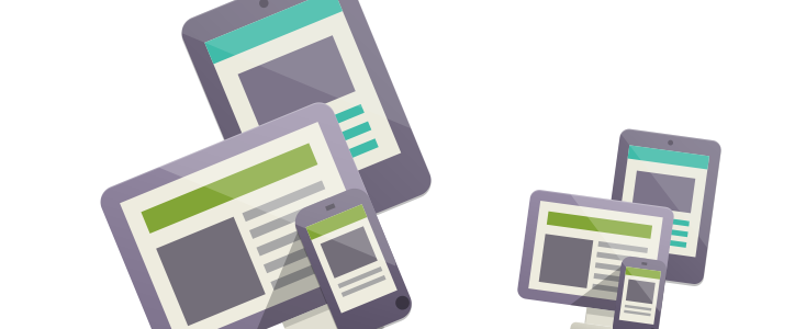
Creating a Responsive template for this site has not been easy! In fact it takes a lot more time to create a good responsive template. Costs increase, technical know-how is needed and at the back of the mind you don't really know what the future holds and how quickly things can change with Responsive templating.
One new feature that will change everything is the Apple named 'Retina' Displays. We will take a closer look at this technology and find out what it means for us template designers and Responsive Templating.
TIP: Want to know more Responsive Templating? Read: Responsive Templates Explained.
What exactly is the Apple Retina Display?
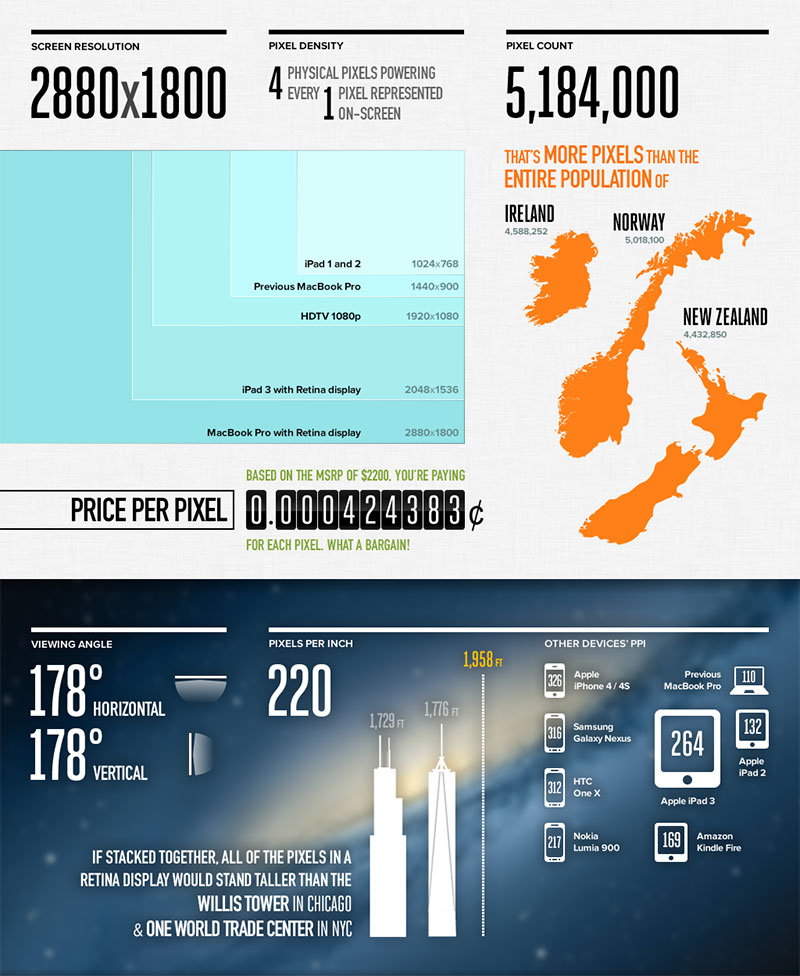
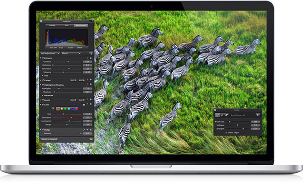
Image by Aaron Draczynski
All displays are made up of 'device pixels' or as some like to call 'physical pixels'. Every pixel is given a colour and/or brightness as set by your operating system.
The distance between a user and his screen makes the eye believe it's seeing a full image as it cannot detect the individual pixels.
Now, if you take the amount of device pixels for your screen you will get whats called the Screen Density measured in Pixel Per Inch 'PPI'. Apple have doubled the Screen Density of their Retina Displays.
Containing 3 million more pixels than a HDTV! Images will be much sharper with incredible colour.
So what does that mean for web design and templating?
Glad you asked, as it means a lot. Larger, crisper images have a higher file size and on a mobile device this would be very noticeable! This however could be fixed by having 2 copies of all your images...
One for Retina Displays and One for normal displays, but this also has it's cons including using up more of your precious server space, and of course your time.
Current Solutions
- Why fuss... I will just serve images for retina displays
This could be a option but it means using more bandwidth, longer load times, and high quality images will suffer on low PPI devices making this idea useless for many designers. Losing image quality would be a big no-no for most!
- Javascript
This is a very easy solution to set up but it comes with cons. The biggest being that Modern Browsers will begin downloading the first image before it can detect a retina capable device... Once detected it will be replaced but why would you want to force the user to double download.
- Elements and CSS
Using this option over Javascript means you would only load one image. But this option really is not feasible. It is supported by WebKit browsers and Most Mobile Browser but not all, especially Firefox and IE. This just wouldn't work for most people and goes against the web design communities need for a standard.
- Server Side Detection
Again this option will only load one image but would be rendered useless by a CDN (Content Delivery Network). CDN's are used by many websites now-a-days, especially large websites. CDN's will not do Server Side Detection so whatever images the CDN loads will be what you get across all devices.
To Fret Or Not To Fret?
So as you can see there is no great solution available yet and I imagine the 4 options above will appeal to a variety of people for a variety of reasons. There is a big BUT!
Retina Displays are not yet widely used so it's something you don't have to be on top of quite yet. Especially as the industry is working hard on a good standard solution for this problem.
All in all folks. It's just another step forward in the ever-moving design industry. Apple is not the only company working on high density displays, and you can be assured that in the not to distant future it will be standard.
It's very much worth keeping an eye on the advance of high density displays and ways for you as a designer to utilise these screens for the ultimate web site. This could mean more work, but in a world with so many devices and better screen types, it's vital we continue to remain responsive across the range.