

There were significant updates to Joomla in the release of version 3.0. Most of them were design oriented. Many of the functionality changes happened during the upgrade from Joomla 1.5 to 1.6. The UX (User Experience) team at Joomla worked hard to make it a more appealing interface both on the backend and frontend.
So lets jump in. First lets talk about the administrator template since that is what most people who use Joomla will see the most of.
Administrator Template: Control Panel Version 2.5
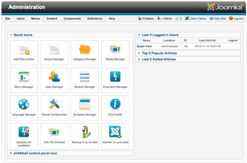
Notice the 'Quick Icons' and the square layout that is only focused in the center. It leaves little room for other sections to appear. The top menu is small and out of the way, but I have always used it way more than the big 'Quick' icons!
Administrator Template: Control Panel Version 3.0
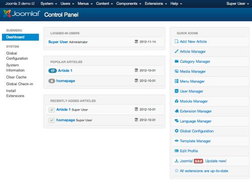
Graphically, you can tell right away that this site is much cleaner. The colors are simplified down to a basic white and blue color scheme. While that sounds boring, it does help you focus on what the titles of the menu say. It also helps to highlight notifications like the "Joomla! 3.0.2, Update now!" notification at the bottom of the screen.
The icons have been shrunk down to a much smaller size. Joomla now uses a standard set of icons. Lastly, I mentioned the top menu was "...out of the way..." in 2.5, in 3.0 they spent time getting the menu size just right. It's easier to read everything and it looks cleaner.
Administrator Template: Article Manager Version 2.5
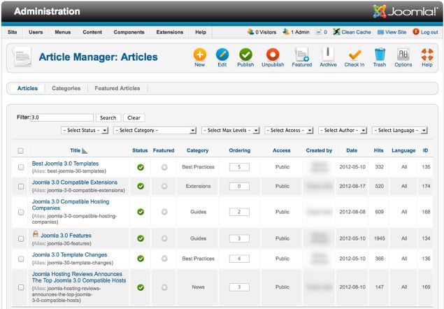
This is the administrator template that many Joomla users are used to seeing. For the most part it has not changed since Joomla's original release. There is lots of small text, and keeping everything in order can be somewhat difficult, especially on large sites (lots of pages). The tools are all up in the right hand top corner and the icon's are bigger than the words.
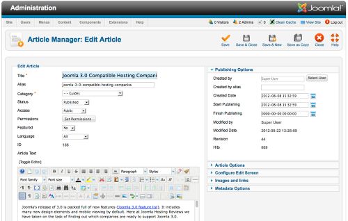
Administrator Template: Article Manager Version 3.0
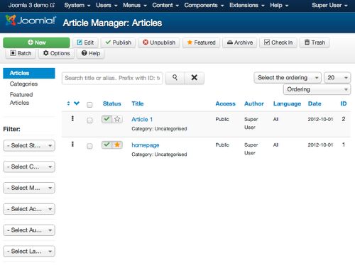
In Joomla 3.0 you can see a much cleaner and more focused article manager. Here many elements have been refined. The filter is now more prominent on the left column and search has a higher priority at the top of the content.
The tool menu above the articles has smaller icons and larger text. The buttons make it easier for users to know when they have pressed a button. They are easier to read and it makes the most important task obvious; which is, the green 'New' button.
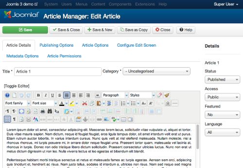
Administrator Template: Article Editor Version 2.5
In Joomla 2.5 the biggest problem was the fact that you have to scroll down to start working on your article. Joomla makes you go through some less important article options before you can see the article below.
The menu on the right column can get very hectic. When you open or close the menu it pushes the whole browser view down and up. It could make you dizzy if you open and close them enough.
Administrator Template: Article Editor Version 3.0
Wow, this is so much better. ALL of the options I was mad about have been moved to the right column. Only the important information has been left above the article content. The options that were on the right menu that collapsed and moved the screen up and down have been turned into tabs. Simple select a different tab and you're good to go.
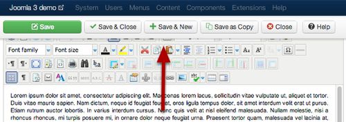
Another cool features which only makes sense when you take a picture, is the top menu that now floats! If you scroll down the content your top menu sticks at the top of your browser. You can see how, in the picture, it covers some of the content editor.
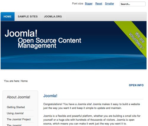
Frontend Template: Home Page 2.5
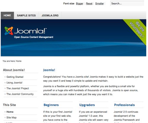
Joomla 2.5 has a decent default template. But, honestly, not many people stick with default templates. Usually you can find better ones.
The picture is a bigger and takes up a large amount of space. At the top there is some unnecessary font size option that most people will not use.
Frontend Template: Home Page 3.0
Joomla 3.0 has a much cleaner look. For the most part the major change is in the simple design. Joomla adopted Twitter's Bootstrap which has a ton of standard graphic elements which helped define the look of the new default template.
The left menu modules have a different style to them. On the main picture, instead of a static Joomla logo, there is now live text. The largest change in the design is that everything is now responsive.
Conclusion
Most of the major template changes are design related. For usability, the administrator interface went through a total transformation. Now the menus do not get in the way of content yet are easy to access with tabs. The incorporation of Bootstrap helps tie all of the website elements together and will remain consistent. Lastly, now that all of the templates are responsive, Joomla is much more modern.
Joomla 3.0 will gain users that have been afraid to use it in the past because of it's poor graphic look. It had also been criticized for not embracing new web trends as fast as other CMS's. Hopefully with the new release cycles, many of those criticisms will be silenced.